


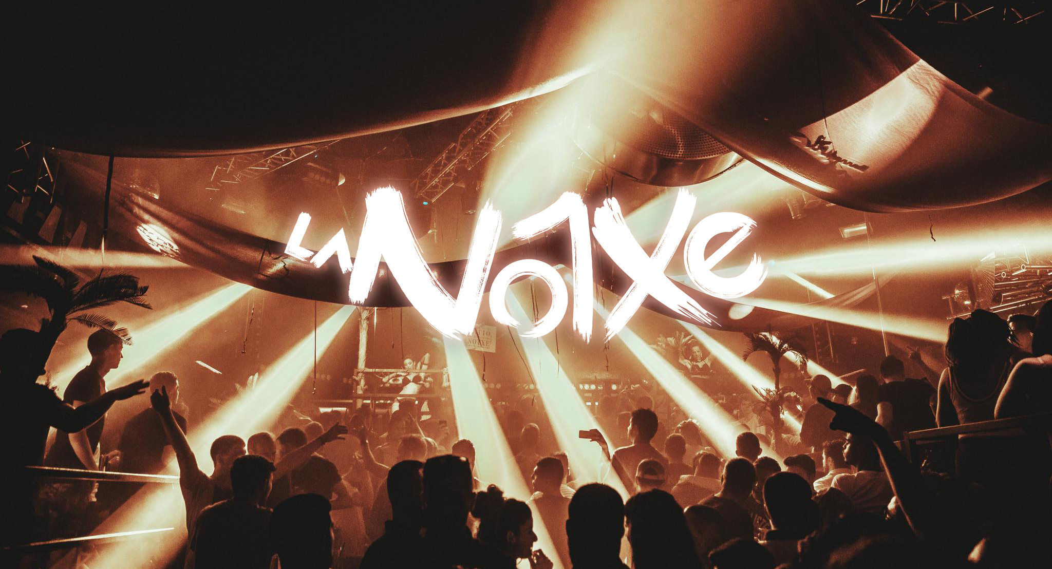
La Notxe is a series of parties organized in Mad Club, one of the most important clubs in Switzerland.
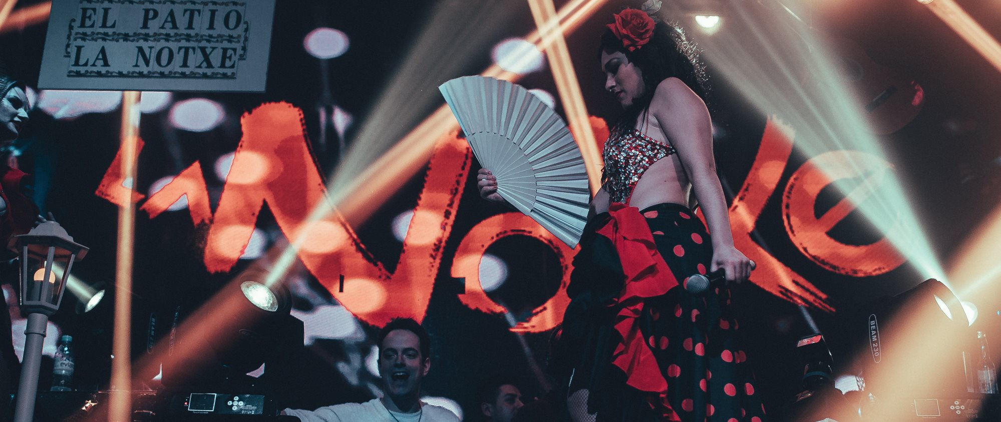
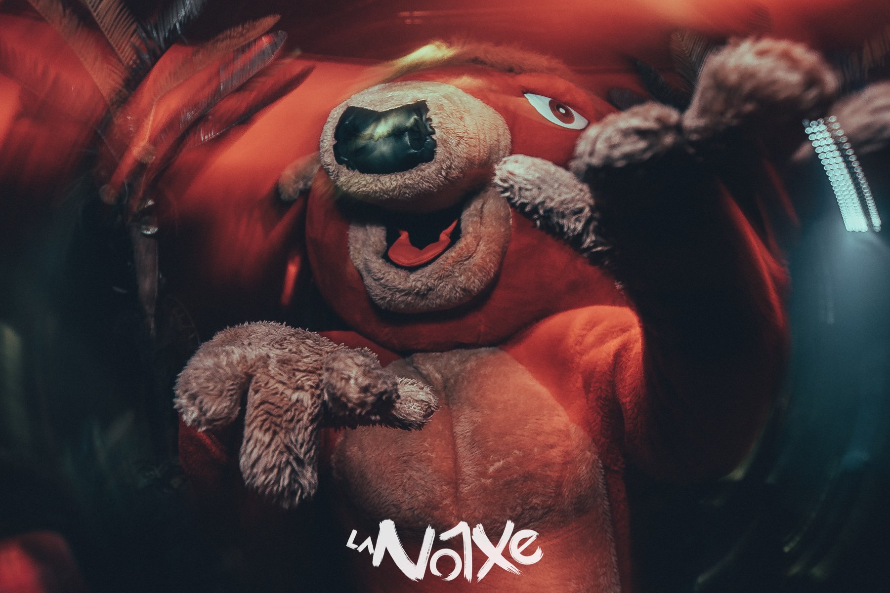
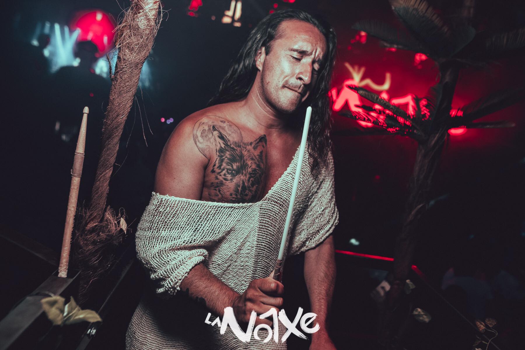
The concept of La Notxe is no usual clubbing experience; its history and atmosphere make it totally unique. A mix of electronic music and spanish rythms in harmony with an exhilarating visual performance resulting in an explosive and spectacular show.
The ‘Notxe family’ spirit brings clubbers together every day in a ‘happy and free’ style community. They envision a night life, sharing their ultra-sexy passion, mixed with audacious and talented musicians.
Unbridled fun is what describes the experience of this unique cabaret party.
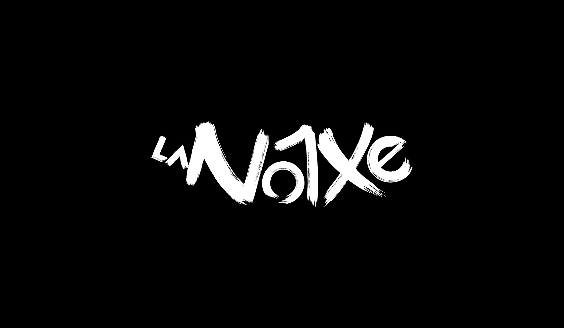
To sum up the wild nature of La Notxe, a whole typeface identity was created.
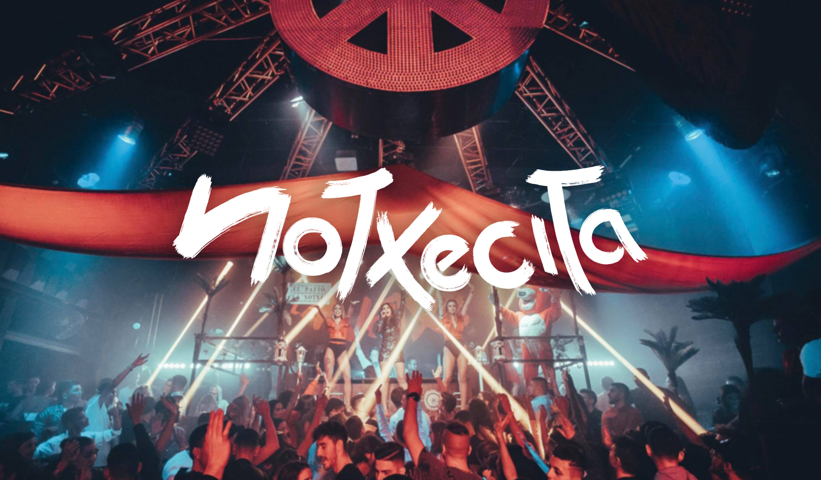
The main logo of the event is characterized for its boldness, its spanish origins and the dynamism of the kerning which creates the fun movement but keeping a symmetric harmony.
Customized brushes where made for the drawing of the characters which needed some rough edges that inspire the artistic focus of the event.
The lines are curvy and daring, a hint of the sensual flow of the live performances.
After la Notxe’s big success, other projects came out under the same identity.
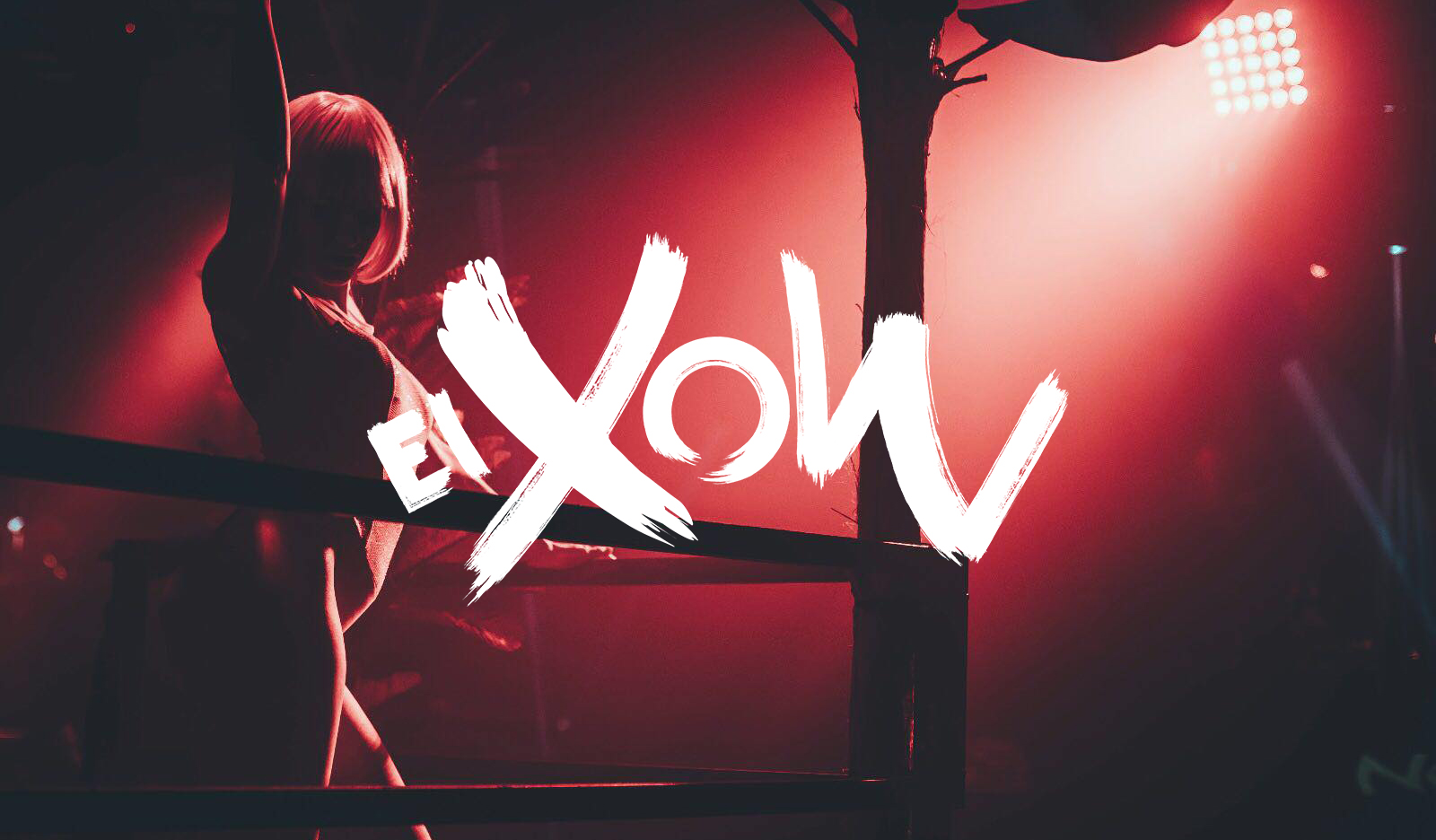
El Xow is the version of the experience that is focused in the show rather than the party, but it keeps its sensual and exhilarating tone.
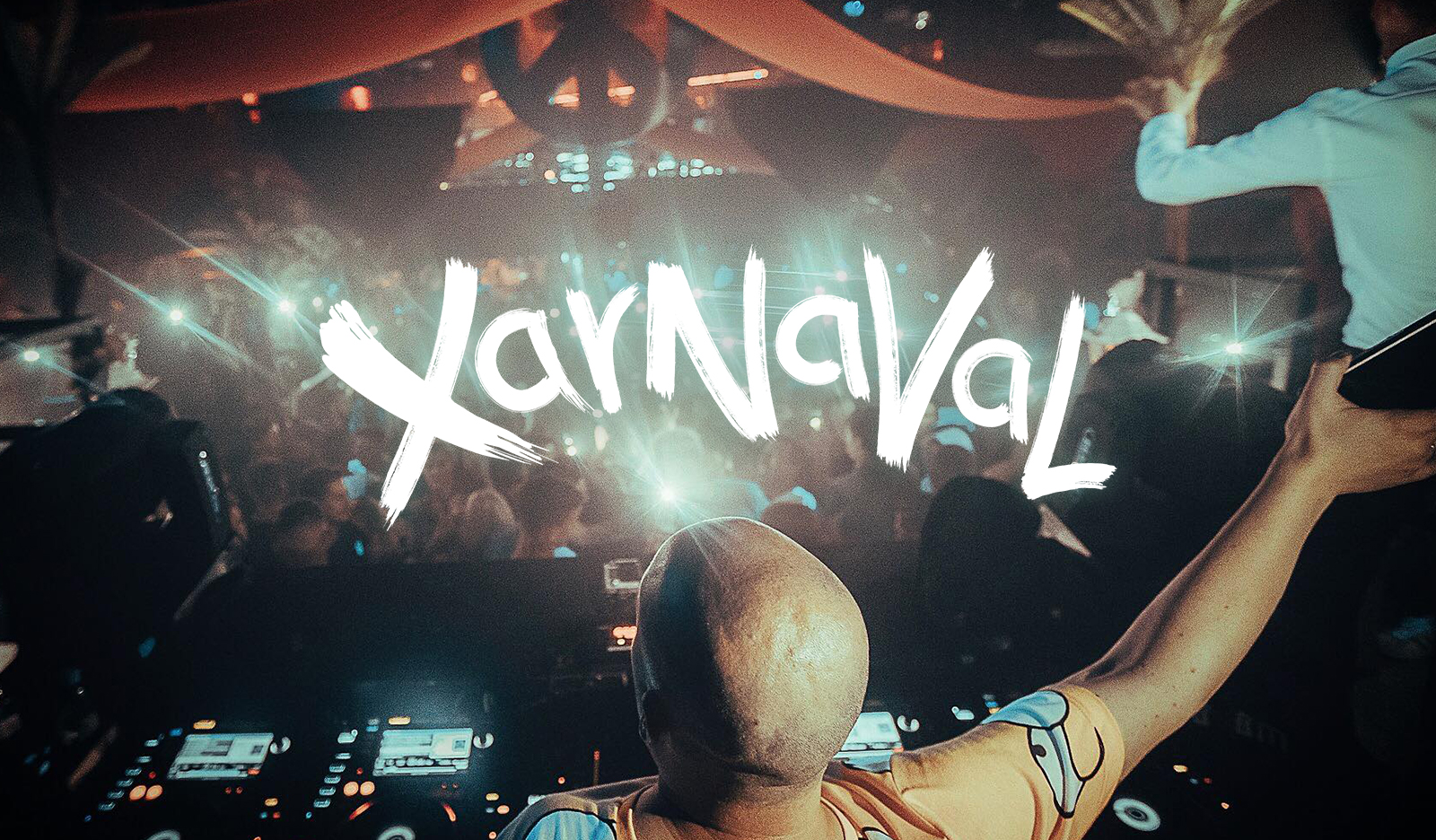
Xarnaval is a yearly event, their own Carnaval party branded under the same values.
Notxecita was the first overseas version of la Notxe out of Switzerland, it was a little adaptation of the concept in a club in Colombia.
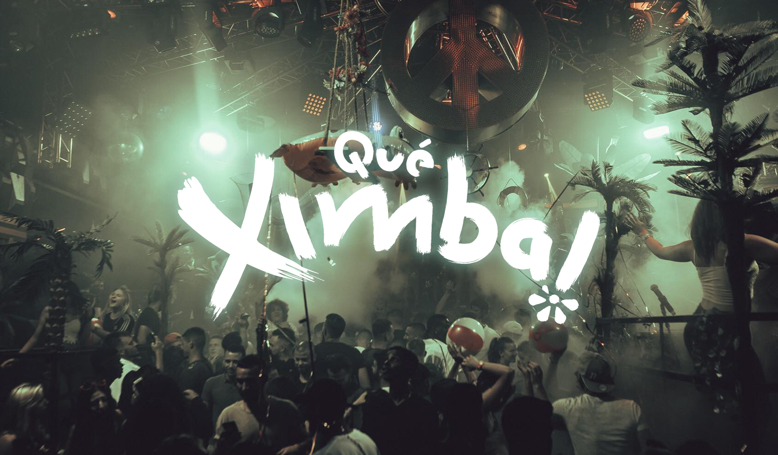
Qué Ximba! happened right after la Notxecita when the project came back from South America completely influenced by latin-american culture.
More tropical and artistic, this version of the event moves the concept away of flamenco and rumba to cumbia and reggaeton.